Dot Dot Dot Property icons
Dot Dot Dot is a property guardianship service, which turns empty buildings into temporary homes.
The company already had a strong visual identity, but needed a set of icons for use on their website, social media, and printed materials.
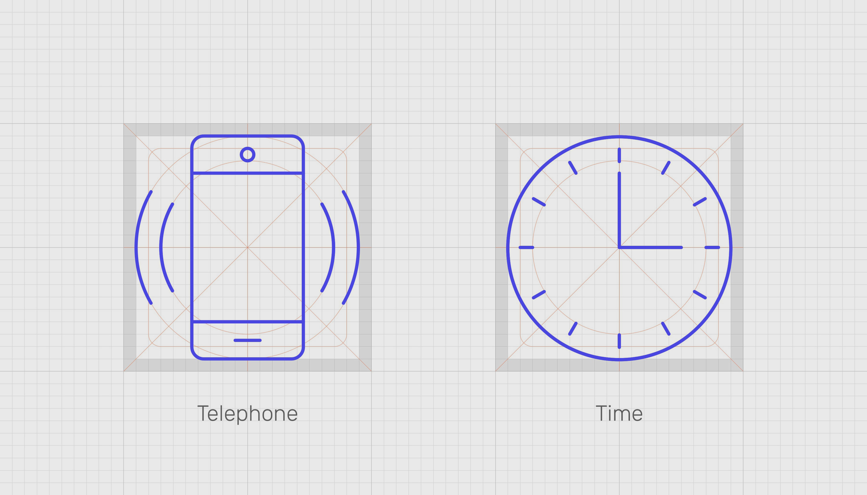
I designed a set of 28 icons, making use of they key characteristics of their logo: fine lines and circles. I designed the icons to fit to a 20 x 20 grid, ensuring consistency across all the designs, and produced them in outline and solid versions, in the brand’s four core colours, as well as black and white.